SVG漸變
漸變是指形狀內一種顏色平滑過渡到另一種顏色。 SVG提供了兩種類型的漸變。
- 線性漸變 - 表示從一個方向到另一個方向的一種顏色到另一種顏色的線性轉換。
- 徑向漸變 - 表示從一個方向到另一個方向的一種顏色到另一種顏色的圓形過渡。
線性漸變
以下是<linearGradient>元素的語法聲明。 我們只顯示了一些主要的屬性。
<linearGradient
   gradientUnits ="units to define co-ordinate system of contents of gradient"
   gradientTransform = "definition of an additional transformation from the gradient coordinate system onto the target coordinate system"

   x1="x-axis co-ordinate"
   y1="y-axis co-ordinate"
   x2="x-axis co-ordinate"
   y2="y-axis co-ordinate"

   spreadMethod="indicates method of spreading the gradient within graphics element"
   xlink:href="reference to another gradient" >
</linearGradient>
屬性
編號
名稱
描述
1
gradientUnits
用來定義梯度內各種長度值的座標系的單位。 如果gradientUnits =「userSpaceOnUse」,則值表示使用漸變元素時當前用戶座標系中的值。 如果patternContentUnits =「objectBoundingBox」,則值表示在使用漸變元素時就地引用元素上的邊界框的分數或百分比值。 默認是userSpaceOnUse。
2
x1
梯度向量的x軸座標,缺省值是0。
3
y2
梯度向量的y軸座標,缺省值是0。
4
x2
梯度向量的x軸座標。 缺省值是0。
5
y2
y軸座標的梯度向量。 缺省值是0。
6
spreadMethod
指示在圖形元素內散佈漸變的方法。 默認是'pad'。
7
xlink:href
用於指另一個漸變。
示例
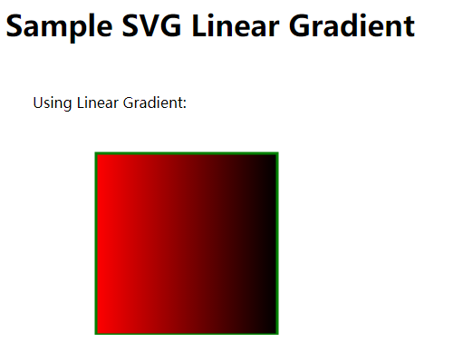
文件:testSVG.html -
<html>
   <title>SVG Linear Gradient</title>
   <body>

      <h1>Sample SVG Linear Gradient</h1>

      <svg width="600" height="600">

         <defs>
            <linearGradient id="sampleGradient">
               <stop offset="0%" stop-color="#FF0000" />
               <stop offset="100%" stop-color="#00FFF00" />
            </linearGradient>
         </defs>

         <g>
            <text x="30" y="50" >Using Linear Gradient: </text>
            <rect x="100" y="100" width="200" height="200" stroke="green" stroke-width="3"
            fill="url(#sampleGradient)" />
         </g>

      </svg>

   </body>
</html>
以下是對上面代碼的一些解釋 -
- 定義爲
sampleGradient的一個<linearGradient>元素。 - 在
linearGradient中,兩個偏移量用兩種顏色定義。 - 在
rect元素中,在填充屬性中,指定漸變的URL以使用之前創建的漸變填充矩形。
在Chrome瀏覽器中打開文件:testSVG.html,得到以下結果 -
徑向漸變
以下是<radialGradient>元素的語法聲明。 我們只顯示了一些主要屬性。
<radialGradient
   gradientUnits ="units to define co-ordinate system of contents of gradient"
   gradientTransform = "definition of an additional transformation from the gradient coordinate system onto the target coordinate system"

   cx="x-axis co-ordinate of center of circle."
   cy="y-axis co-ordinate of center of circle."

   r="radius of circle"

   fx="focal point for the radial gradient"
   fy="focal point for the radial gradient"

   spreadMethod="indicates method of spreading the gradient within graphics element"
   xlink:href="reference to another gradient" >
</radialGradient>
屬性
編號
名稱
描述
1
gradientUnits
用來定義梯度內各種長度值的座標系的單位。 如果gradientUnits =「userSpaceOnUse」,則值表示使用漸變元素時當前用戶座標系中的值。 如果patternContentUnits =「objectBoundingBox」,則值表示在使用漸變元素時就地引用元素上的邊界框的分數或百分比值。 默認是userSpaceOnUse。
2
cx
最大圓梯度矢量中心的x軸座標。 缺省值是0。
3
cy
最大的圓梯度矢量中心的y軸座標。 缺省值是0。
4
r
梯度矢量最大圓的中心的半徑。 缺省值是0。
5
fx
徑向漸變的焦點,缺省值是0。
6
fy
徑向漸變的焦點。 缺省值是0。
7
spreadMethod
指示在圖形元素內散佈漸變的方法。 默認是'pad'。
8
xlink:href
用於指另一個漸變。
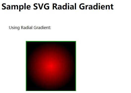
示例
文件:testSVG.html -
<html>
   <title>SVG Radial Gradient</title>
   <body>

      <h1>Sample SVG Radial Gradient</h1>

      <svg width="600" height="600">
         <defs>
            <radialGradient id="sampleGradient">
               <stop offset="0%" stop-color="#FF0000" />
               <stop offset="100%" stop-color="#00FFF00" />
            </radialGradient>
         </defs>

         <g>
            <text x="30" y="50" >Using Radial Gradient: </text>
            <rect x="100" y="100" width="200" height="200" stroke="green" stroke-width="3"
            fill="url(#sampleGradient)" />
         </g>
      </svg>

   </body>
</html>- 定義爲
sampleGradient的一個<radialGradient>元素。 - 在
radialGradient中,兩個偏移量用兩種顏色定義。 - 在
rect元素中,在填充屬性中,指定漸變的URL以使用之前創建的漸變填充矩形。
在Chrome瀏覽器中打開文件:textSVG.html -